Tag: Infographics
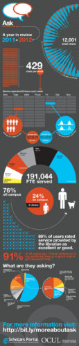
Infographic: Ontario Council of University Libraries: “Ask a Librarian” Usage Statistics, 2011-2012
“12,001 chats in 218 days” – via U. of Toronto Twitter The following infographic provides a look at the Ontario Council of University Libraries, Ask a Librarian service that launched on September 12, 2011 with the following institutions: University of Guelph University of Guelph-Humber Lakehead University Ryerson University York University University of Toronto – St.George […]

Just Released: Free iPad App from IBM Reinvents Iconic ’60s-Era Infographic on History of Math
From IBM: To celebrate the history of math and its impact on the world, IBM has released Minds of Modern Mathematics, an iPad app that re-imagines a classic 50-foot infographic on the history of math created by husband-and-wife design team Charles and Ray Eames and displayed at the 1964 World’s Fair in New York City. […]
Reference: A New Infographic From NASA, The Future of American Human Space Flight
Direct to Interactive Infographic A static version (PDF) is also available. Nancy Atkinson summarizes the interactive and infographic at Universe Today.
More Infographics Posts
Infographic: Friends & Frenemies: Why We Add and Remove Facebook Friends
From NM Incite: To friend or to de-friend, that is the question. New research from NM Incite, a Nielsen McKinsey company, reveals that there are innumerable factors that help Facebook users decide to add a friend or cull someone from the fold, though knowing someone in real life is the top reason cited for friend-ing […]
Infographic: How Students Listen to Music
Focus: High School and College Students. Published by AdAge on December 13, 2011. Data from YPULSE Report. Click to Access Larger Versions of Infographic (on AdAge Site)
New Infographic: What Are People Doing Online?
The infographic via the Flowtown Blog utilizes data from Pew Internet and American Life Project tracking survey’s (2009-2011).
ADVERTISEMENT
ADVERTISEMENT
Reference Resources: New Infographic: Facebook Facts and Figures 2011
A new and stat rich infographic with from the Website Monitoring Blog team. It utilizes numbers from Facebook as well as SocialBakers.com Direct to the Website Monitoring Blog to grab the code for the full size infographic. Website Monitoring Also Makes “Facts and Figures” infographics available for the following services and devices: WordPress Facts & […]
Charts: "What Was Popular on the Internet in September 2011"
The team at Website Monitoring has posted their monthly compilation of six web “popularity” charts for the month of September. Charts are also available for Top 25 Sites (via Alexa) and Web browsers market share in September 2011 (via Statcounter). Direct to Complete Blog Post (All Six Charts On One Page) Via Website Monitoring Blog
ADVERTISEMENT
Interactive Map: Levels of Internet Filtering in Asia and the Middle East
The interactive map is titled, “Censorship on the March” and shows Internet filtering in four areas: 1. Political 2. Social 3. Conflict 4. Internet Tools Data sources are OpenNet Initiative and the United Nations.
Reference: Fast Facts: "Cost Estimates of Storm Irene on U.S. States"
Direct: Reuters Factbox A state-by-state rundown. Direct to Reuters Hurricane Irene Aftermath Map Direct to Chart: U.S. Weather Disasters in 2011 10 $1 Billion+ Events So Far This Year
