Tag: Data Visualization
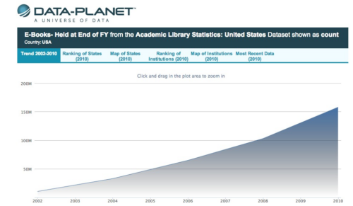
Visualizing Library Statistics: Academic Library Ebook Holdings, 2002-2010
Click the graphic or this link to view an interactive version and additional data. This post marks the beginning of a new feature on LJ‘s infoDOCKET where we will share interactive visualizations of library and library related statistics using data sets from several sources. We would like to thank Matt Dunie and the team at […]

Just Released: Free iPad App from IBM Reinvents Iconic ’60s-Era Infographic on History of Math
From IBM: To celebrate the history of math and its impact on the world, IBM has released Minds of Modern Mathematics, an iPad app that re-imagines a classic 50-foot infographic on the history of math created by husband-and-wife design team Charles and Ray Eames and displayed at the 1964 World’s Fair in New York City. […]
Reference: U.S. Census Releases Graphs on Historical Voting Trends
From a U.S. Census Bureau E-Mail: The Census Bureau has released 10 graphics that highlight national trends in voting by race, age, education, and other characteristics since 1964. Four graphics address presidential elections, four address congressional elections and two address all national elections. All are based on previously released tabulations from the November Voting and […]
More Data Visualization Posts
Recently Launched: Interactive Access to CDC’s HIV and STD Data
From the AIDS.gov Blog: The Center for Disease Control and Prevention (CDC) has launched a new interactive web tool—the NCHHSTP Atlas—that allows users to create maps, charts, and tables using HIV/AIDS and sexually transmitted disease (STD) data collected by CDC’s National Center for HIV/AIDS, Viral Hepatitis, STD, and TB Prevention (NCHHSTP). [Clip] Many public health […]
Visualizations: The World of Wikipedia's Languages Mapped
From The Guardian: What happens if you map every geotagged Wikipedia article – and then analyse it for language use? A team of Oxford University researchers has found out. [Clip] Mark Graham and the team at the Oxford Internet Institute (who’ve mapped zombies and every geotagged picture on Flickr) decided to find out as part […]
Reference: Science: NASA Releases Visual Tour of Earth's Fires
From a NASA Web Site: NASA has released a series of new satellite data visualizations that show tens of millions of fires detected worldwide from space since 2002. The visualizations show fire observations made by the MODerate Resolution Imaging Spectroradiometer, or MODIS, instruments onboard NASA’s Terra and Aqua satellites. [Clip] One of the new visualizations […]
ADVERTISEMENT
ADVERTISEMENT
Paper — Six Provocations for Big Data
Six Provocations for Big Data The era of Big Data has begun. Computer scientists, physicists, economists, mathematicians, political scientists, bio-informaticists, sociologists, and many others are clamoring for access to the massive quantities of information produced by and about people, things, and their interactions. Diverse groups argue about the potential benefits and costs of analyzing information […]
Data Visualization/Map from NOAA: July 2011 Was Hot! Hot! Hot!
From the NOAA Environmental Visualization Lab: How hot was the month of July in 2011? So hot that just by plotting the location of each daily heat record that was broken, a nearly complete image of the contiguous United States is visible. Almost 9,000 daily records were broken or tied last month, including 2,755 highest […]
ADVERTISEMENT
Reference: Lists & Rankings: Most Popular Baby Names in England & Wales, 2010
From the Office For National Statistics: Oliver retained the top spot this year, with Jack still the second most popular baby name. Charlie rose two places to number five, William climbed up one to number seven and George re-entered the top 10 at number nine, up from eleven last year. James fell one place to […]
Reference: Interactive Visualization: The Growth of Newspapers Across the U.S. 1690-2011
Direct to Interactive Visualization This visualization plots over 140,000 newspapers published over three centuries in the United States. The data comes from the Library of Congress’ “Chronicling America” project, which maintains a regularly updated directory of newspapers. See Also: Journalism’s Voyage West: Visualizing US Newspapers, 1690-2011 (Animations) See Also: More Interactive Visualizations Source: Rural West […]
