The World Bank Introduces the Global Infrastructure Map, Provides Access to 55 Layers of Geospatial Data
From The World Bank:
Some ten years back, World Bank staff working in the Africa Region came up with the idea of producing simple infrastructure atlases for each African country. As these atlases took shape, it was amazing to see how clearly each country’s infrastructure story came into focus. We were struck by how closely national infrastructure networks mirrored physical and economic geography, how much they were shaped by the major supply chains underpinning local economies, and even the extent to which conflict-affected areas suffered from an absence of infrastructure.
Building on these early experiences, This has meant a combination of compiling and collating relevant public domain datasets, and selectively acquiring key proprietary datasets.
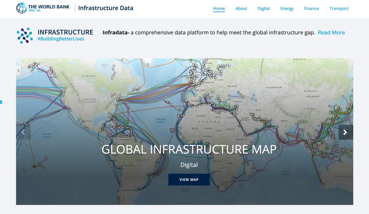
The resulting map offers some 55 layers of geospatial data at – https://infradataworldbank.org
- The map includes many important layers of geographic context, such as topography, climate, population, disaster risk, agricultural activity, and administrative boundaries.
- For digital infrastructure, the only non-proprietary data layers available relate to submarine cables.
- For energy infrastructure, the map displays power plants (by size and technology), as well as grid infrastructure and nightlights
- For transport infrastructure, layers include roads (by category) and rail networks, as well as seaports and airports, and a friction surface portraying the extent of isolation from cities.
- In addition to the networks themselves, the map includes choropleth layers that allow cross-country comparisons on country level economic indicators such as cellular subscriptions, energy intensity, or container port traffic.
- The map also conveys international interactions through lines that visualize a country’s imports and exports of different types of energy, and eventually its connectivity links with other countries through air or sea transportation.
Learn More, Read the Complete World Bank Blog Post
Direct to Global Infrastructure Map
Filed under: Data Files, News
About Gary Price
Gary Price (gprice@gmail.com) is a librarian, writer, consultant, and frequent conference speaker based in the Washington D.C. metro area. He earned his MLIS degree from Wayne State University in Detroit. Price has won several awards including the SLA Innovations in Technology Award and Alumnus of the Year from the Wayne St. University Library and Information Science Program. From 2006-2009 he was Director of Online Information Services at Ask.com.
ADVERTISEMENT
Archives

ADVERTISEMENT