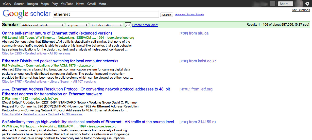
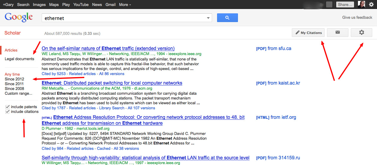
Google Scholar Adopts Google’s New “Modern” Look
No surprise here, Google Scholar has moved to the UI design seen on other Google search interfaces.
From the Google Scholar Blog:
The new modern look brings you improved aesthetics and easier access to frequently used search features. You can now search for recent papers with a single click in the sidebar. You can access advanced search features (for example: search by author) without leaving the search results page by clicking the arrow in the right of the search box.
[Clip]
We’ve also clarified the preferences, err, settings page by organizing it into sections, performed a minor facelift on pages that deal with configuration of email alerts, and next we’ll be working on updating the author profile pages and help pages.
If you’re not seeing the new look (yet) and want to begin using it click here.
If you’re seeing the new “modern” look and what the old look back (temporarily) click here.
Old Look
 New Look

Read the Complete Blog Post
Note: The post does not mention that getting to the Google Scholar interface from the Google homepage now takes three clicks.
1. Click More (at top of page)
2. Click “Even More”
3. Click Google Scholar
See Also: About Three Weeks Ago We Posted About Changes to Google Patents
Filed under: Journal Articles, Resources
About Gary Price
Gary Price (gprice@gmail.com) is a librarian, writer, consultant, and frequent conference speaker based in the Washington D.C. metro area. He earned his MLIS degree from Wayne State University in Detroit. Price has won several awards including the SLA Innovations in Technology Award and Alumnus of the Year from the Wayne St. University Library and Information Science Program. From 2006-2009 he was Director of Online Information Services at Ask.com.


